Smelvetica
Sadly, this received a takedown notice from monotype and their lawyers… so this is all that remains of the project
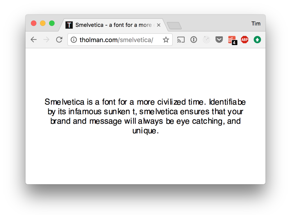
[Smelvetica] was an experimentation in taking one of the worlds most beloved fonts, and turning it into a morbid monstrocity.
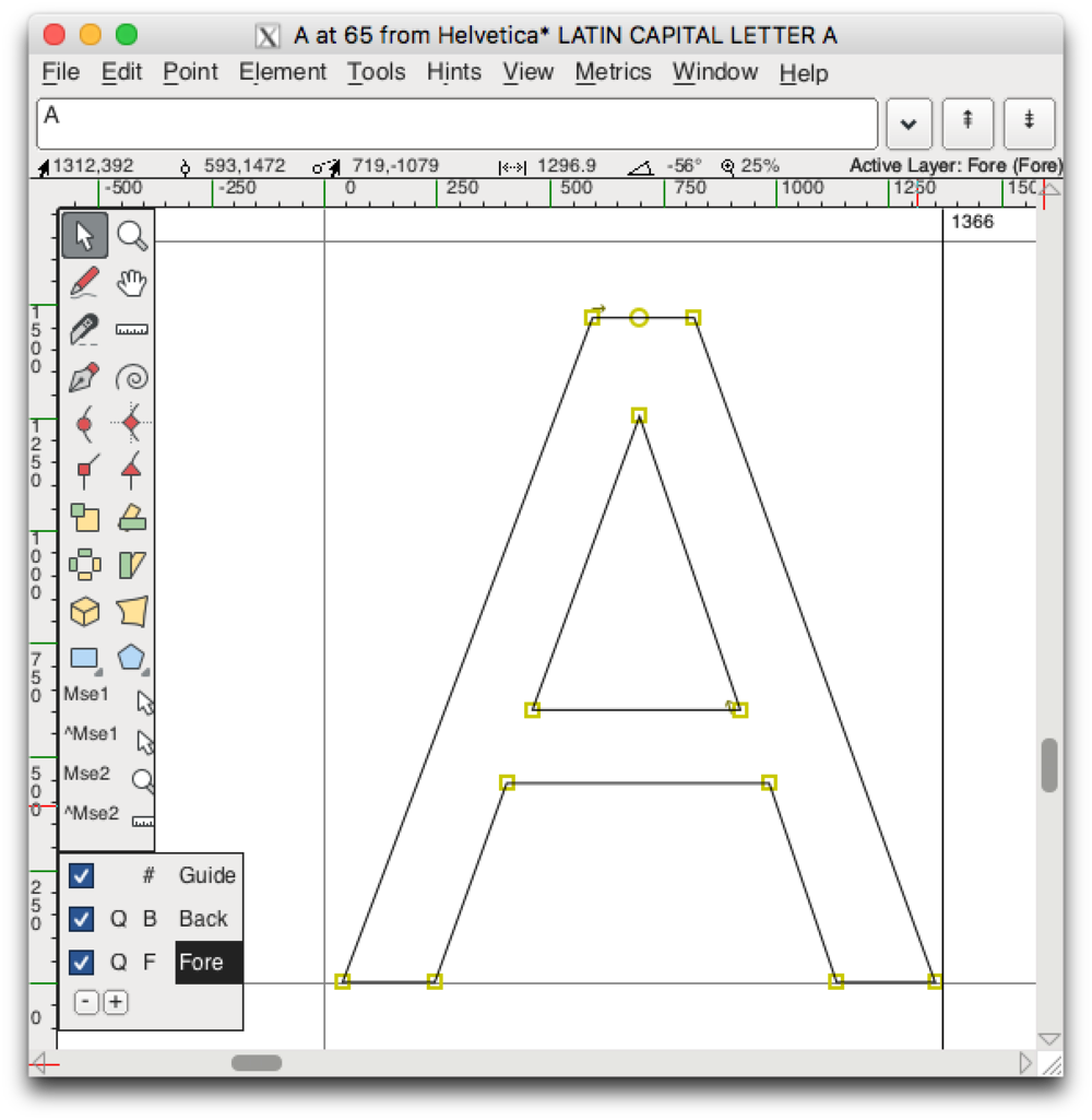
This project began by pulling the original “Helvetica” font from my system files, and making a copy of it. From there I opened it in FontForge, which is a brilliant open source font editor.

From here, the task was fairly simple. I opened up each “version” of Helvetica (these being bold, oblique, light etc), randomly went through the capital and non capital letters and moved them around within their guide grids. This had the desired effect of ruining their beautifully crafted kerning, as such, creating “Smelvetica”.
With the fonts completed, the remaining work was to wrap it all up with a nice web page, and some installation instructions.

The installation ended up being the most devious part of the prank in the end, since it would install on the system it makes it really difficult for anyone to understand why everything looks just that little bit wrong.
Edit: Sadly this was subject to a takedown notice, you can see the brief conversation in the github repository.